Styling external iframe content
When implementing staticman comments for this blog I ran into the issue that the blog has a dark and a light mode that you can switch between (the switch in the upper right) but the ReCaptcha can’t dynamically switch between the dark and light themes it has. And since the ReCaptcha is an iframe from another domain, you can’t apply CSS or JavaScript as one normally would. So now what, pick a theme and give up?
Googling a bit I found this StackOverflow question with a few answers detailing how things like transform:scale(0.8) can be applied to the ReCaptcha iframe. Now I was already using filter: invert(1) to get an easy light-themed version of the rouge-base16-dark code highlighter that comes standard with the hacker theme I based this blog on. You can indeed apply it to an iframe, and the white will be black and the black will be white:
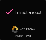
But a dirty piss yellow logo and hot pink check mark? And if you’ve waited too long after clicking the Captcha the warning text is cyan?
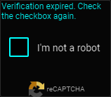
This is just ugly! And also terrible UX, the color cues are completely off. Luckily CSS’ filter-property offers more, most interestingly for this case: hue-rotate().
In w3schools’ words:
- hue-rotate(deg)
- Applies a hue rotation on the image. The value defines the number of degrees around the color circle the image samples will be adjusted. 0deg is default, and represents the original image.
Note: Maximum value is 360deg.
This means that hue-rotate(180deg) will rotate all colors to the opposite color on the color wheel, so cyan becomes red and yellow becomes blue etc. But without touching brightness like invert(1) does. White does not become black or vice versa.
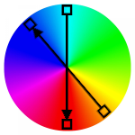
This is what I ended up using, as you can see beneath this article when viewing in dark mode.
1
2
3
4
5
6
7
8
9
10
11
12
/* Default dark mode: */
.g-recaptcha {
	filter: invert(1) hue-rotate(180deg);
	transition: filter .2s ease-in-out;
}

/* ... */

/* Switched to light mode: */
.g-recaptcha {
	filter: invert(0) hue-rotate(0deg);
}
Resulting in a blue ReCaptcha logo, a green check mark and a red warning text. All as intended and in alignment with the UX cues they originally had. Sure it’s not the exact colors of the native dark theme, but close enough and better matching my duo-themed blog.

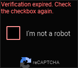
(incidently this might be one of few legitimate uses of hue-rotate(), but let me know any real-life use-cases you know in the comments)
tags: Css - Front-end
Comments
Noice